
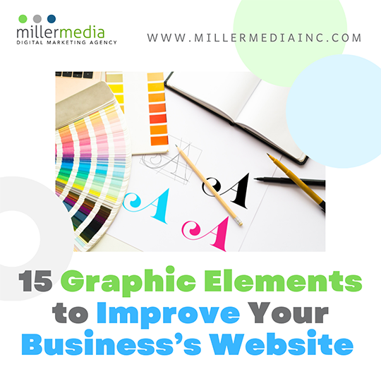
To create a website that grabs viewers’ attention and stands out from your competition it takes a robust study of psychology, sociology, marketing, and graphic design. This can take years and if you are busy business owner your time is limited. While it is best to hire designers internally or a digital marketing agency to create your business’s website, you may not have the budget for it yet, especially if you are a small business. Here are 15 graphic elements you can quickly add that makes you website look a little more upscale and help you gain more profit so that you can build a bigger marketing budget for the future:
1. Half-Page Graphic
Most commonly used for landing pages these elements are pretty simple and allows you to create contrast. Play with layers and give the illusion of depth to help your main product or service photo pop.
https://www.straightfromyard.co.uk
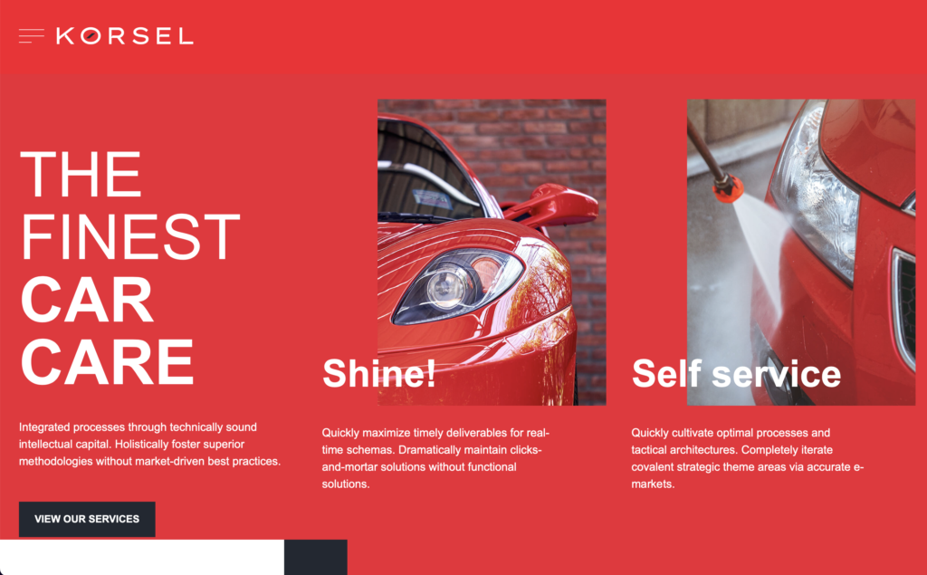
2. A Framed Viewpoint
This element can help you present CTAs (call-to-actions) in fancy ways. Limit the scrolling area in a frame and create empty space at the top and left or right areas. These layouts are often seen on architecture, museum, corporate, and other formal websites.
https://korsel.bold-themes.com/main-demo/home-5/
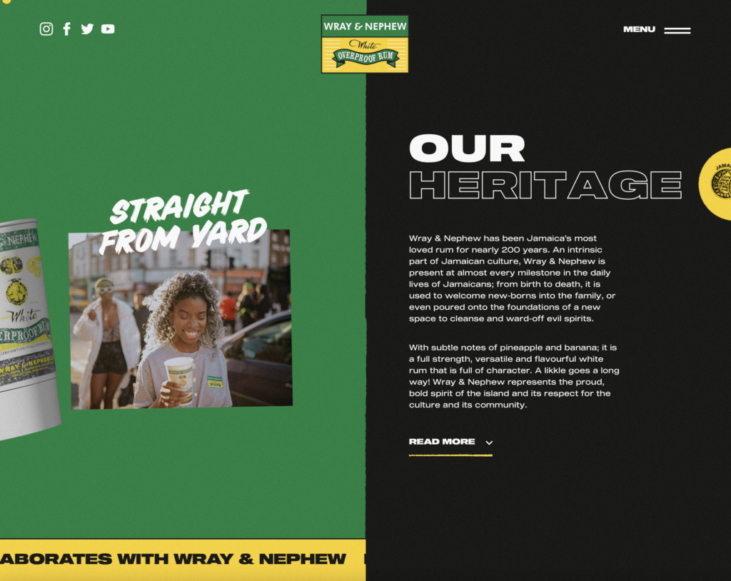
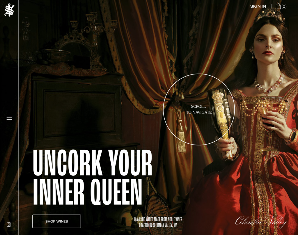
3. Horizontal Scrolling
Think of this element like you are flipping through a book or magazine. This element is best if you have a portfolio of items to show off. For example, you are company sells luxury wine. You can showcase you top sellers on your home page and users can “flip” through to view your brand’s story and products. A word of caution for this element, it can be glitchy on mobile so you may have to deactivate it for phone viewing.
https://scepterandsword.com
4. Translucent Skewed-Shape Layout
Use an abstract shape and dim the opacity a little to partially obscure your product or service shot. It acts as a little sneak peek and gives a feeling curiosity to your website. Brands that also want to covey speed, strength, and boldness usually adopt this layout.
http://www.themestarz.net/html/lovely/index-parallax.html#nav-home

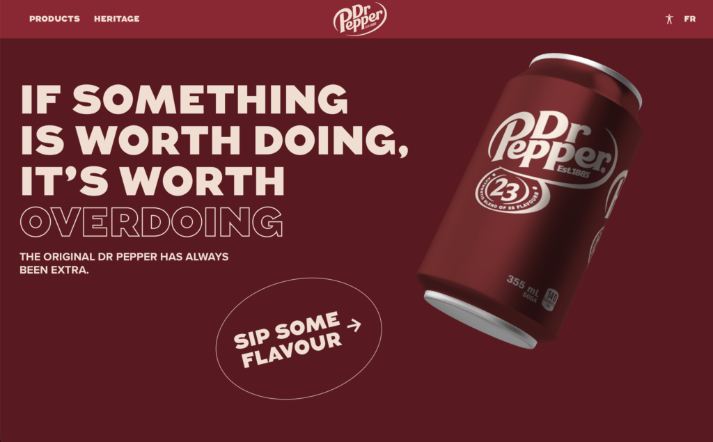
5. Dynamic 3D Renderings
Pre-rendered video or 3D scenes as backgrounds can create a unique look to your product or service. There are free assets available on websites like Canva.com, Pixabay.com, Shutterstock.com, and Adobe.com.
https://www.drpepper.ca/en/
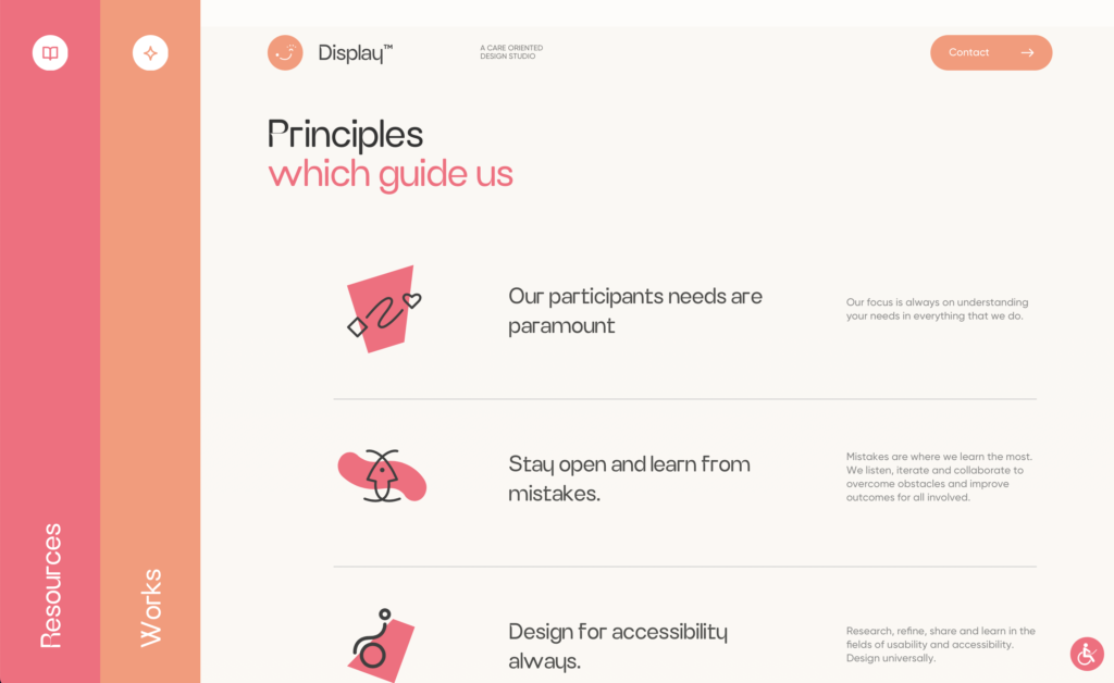
6. Line Design
Lines are an underrated way to clean up you design. Strategically place lines to break up important info. This will also come in handy if your website is copy heavy and has only a few pictures.
https://www.display.care
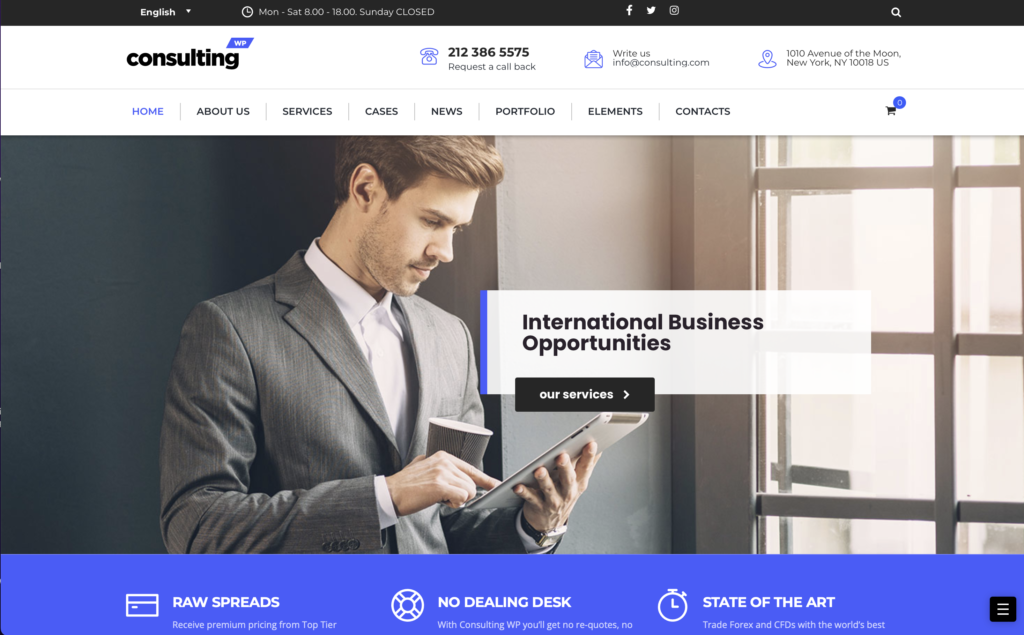
7. Arrow Links
Point to where you want users to go to. Where they are bold or thin, arrows are a universal symbol of direction. Place them in areas you want potential clients to interact with. They can act as a sales trail for visitor.
https://consulting.stylemixthemes.com/barcelona/
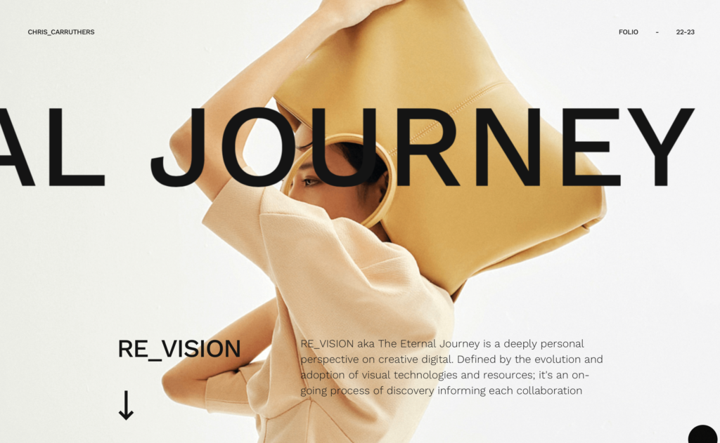
8. Marquee
Use keywords as decorative elements for momentum-scrolling websites. Brands that use short action words should incorporate this element either at the top or the bottom of your home page. This will give you website movement and encourage the user to stay on your page longer. This great if you want to gain a higher-clickthrough rate.
https://chriscarruthers.co.uk/home
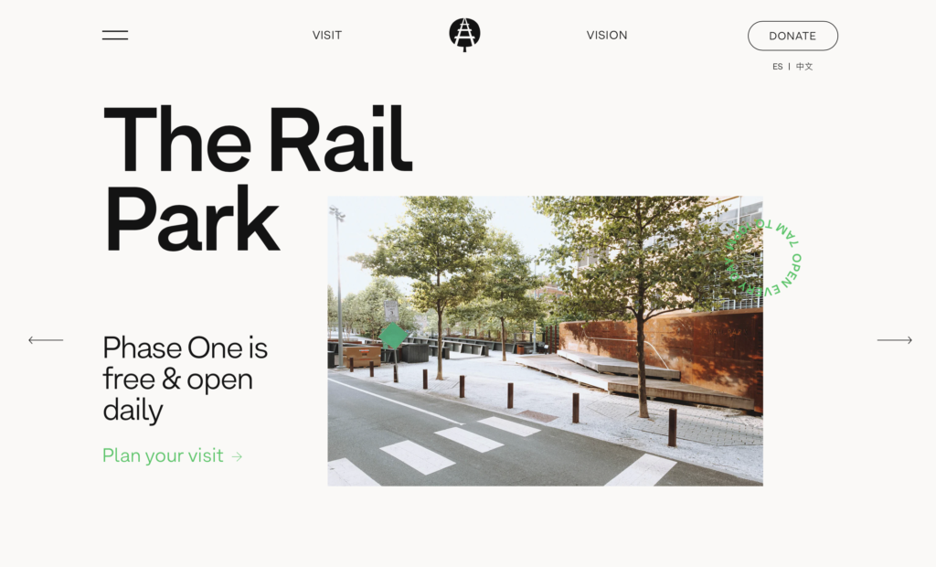
9. Chaotic Centered Hero Piece
This is when a horizontally centered product or service has used different fonts, typefaces, and misaligned images that create abstract look. Be careful with this technique. Avoid putting any important in hard-to-read layouts. This look is mostly for snappy headlines and images that do not show off the product or service directly.
https://www.therailpark.org
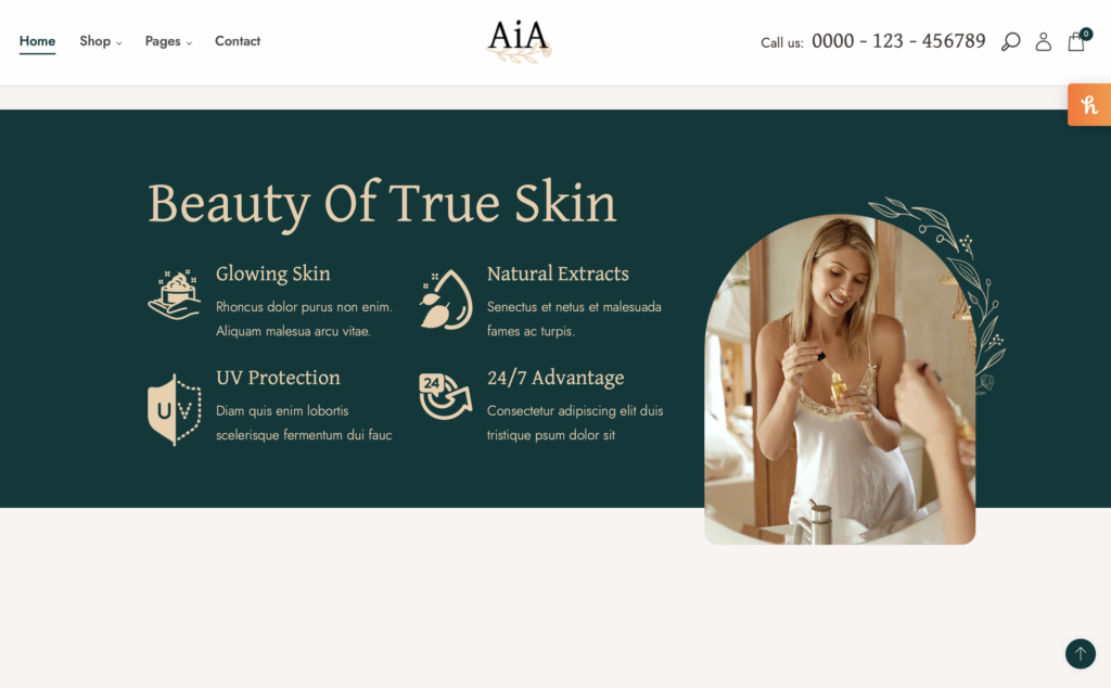
10. Gravestone Images
Gravestone images refer to an image with top border-radiuses edited to make the full composition look like half circle shape or a gravestone. Perfume, Shampoo, Vitamin, and other Wellness or Beauty website adopt this layout to look cleaner and more high-end.
https://dt-aia.myshopify.com
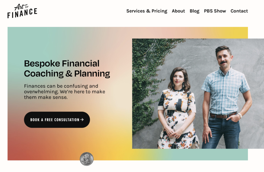
11. Misaligned Card
These kinds of cards have the text floating partially outside the background creating a nice depth effect for your product or service shot. This is best used both in informal and elegant styles. Make sure the drop shadow isn’t too intense otherwise it will look dated.
https://theartoffinance.biz

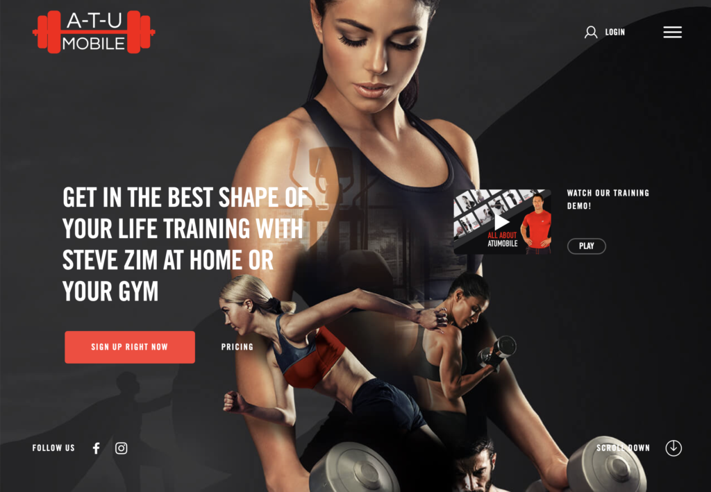
12. Add a Hamburger Menu
In lieu of a traditional navigation where you see all the page names, try a hamburger menu. It appears as 3 lines at the top right corner of your website. Mobile is becoming the first device most people will see your website in, and the hamburger menu is more mobile-friendly than traditional menus.
https://www.atumobile.com
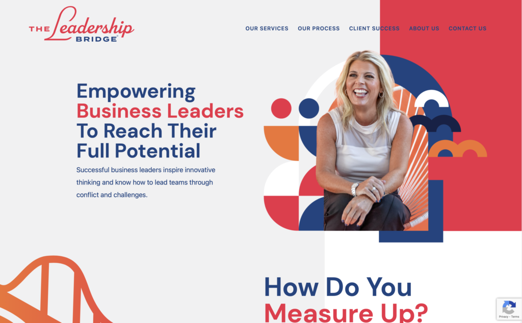
13. Use Bauhaus Shapes
These shapes are generally made with rectangles with maximized border-radius on 1 or 2 corners. Bright colors are also incorporated. Bauhaus design has a rich history, and more people are starting to appreciate it in web design, not just print or architecture.
https://yourleadershipbridge.com
14. Rotated Text
Vertical text for headlines is a great element to create if you want to encourage users to scroll down. Like the marquee style, avoid using for important info, but use for headlines that are easy to read or well known to your audience.
https://avantt.displaay.net
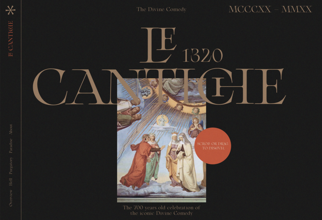
15. Animated Cursor
This element is underutilized by most. Not only is it fun, but it can act as a call to action. Have you mouse cursor come up as a circle that says “click” will encourage more people to interact with your website. User will stay on your website longer if they something to engage with.
https://www.lecantiche.com
Let our team create a website with 1 or more of these elements for you. Call 248.528.360